BK Speed
coffee shop branding
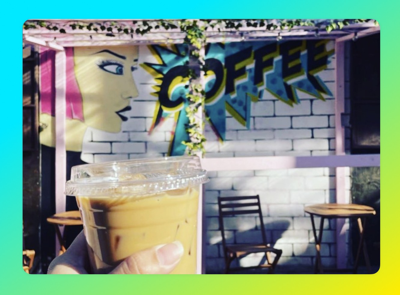
I started a coffee shop in Williamsburg.
We catered towards hipsters, and of course needed very on-point branding to attract our design-savvy and quality-savvy clientele.
Product
Branding & App
Client
BK Speed Coffee
Business Model
B2C
BK Speed
coffee shop branding
I started a coffee shop in Williamsburg.
We catered towards hipsters, and of course needed very on-point branding to attract our design-savvy and quality-savvy clientele.
Product
Branding & App
Client
BK Speed Coffee
Business Model
B2C
BK Speed
coffee shop branding
I started a coffee shop in Williamsburg.
We catered towards hipsters, and of course needed very on-point branding to attract our design-savvy and quality-savvy clientele.
Product
Branding & App
Client
BK Speed Coffee
Business Model
B2C
BK Speed
coffee shop branding
I’m a Product Design leader specializing in sustainable scalability of teams, design systems, & products.
Product
Branding & App
Client
BK Speed Coffee
Business Model
B2C
BK Speed
coffee shop branding
I started a coffee shop in Williamsburg.
We catered towards hipsters, and of course needed very on-point branding to attract our design-savvy and quality-savvy clientele.
Product
Branding & App
Client
BK Speed Coffee
Business Model
B2C
Sizzle Reel
Sizzle Reel

Sizzle Reel

Sizzle Reel

Sizzle Reel

Brief
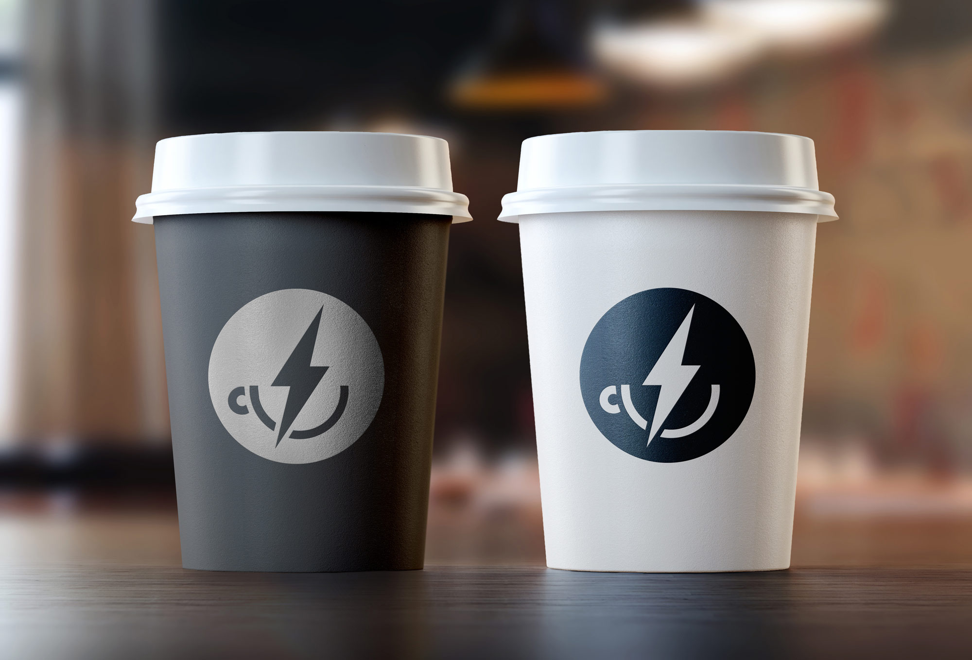
The logo depicts a cup with a lighting bolt in it, a metaphor for the energy a good cup of coffee provides. The logo also works as a visual pneumonic for the shop’s signature brew - a cup of coffee with twice as much caffeine as a regular cup.
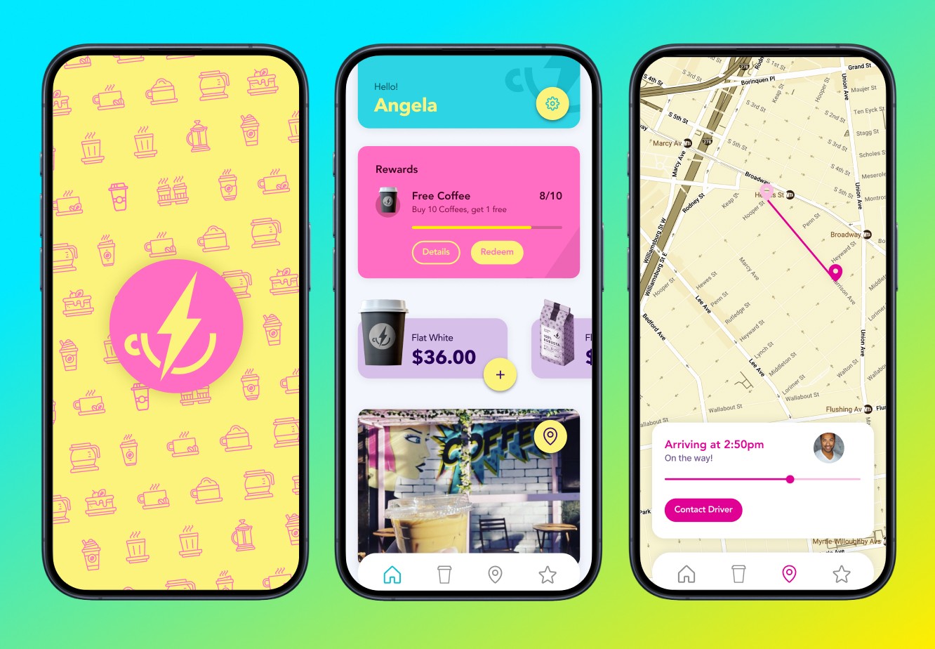
The app offers a way for customers to order delivery and pr-order beverages, food, and coffee beans for pick up. A loyalty program encourages repeat visits.
The logo, branding, app, and physical space are all intended to be fun, inviting, memorable – and reflective of the neighborhood. The color pallet is very different from any existing coffee brand, giving a the distinct impression of the branding being done by a local Designer (that’s me!).
