Data visualization system
This award-winning data visualization system supports 45 user types across 22,000+ users of Interpublic Group’s PaaS and SaaS offerings. Scalability, accessibility, and customization are the core tenants of this Data Visualization System.
Product
SaaS Design System
Client
Interpublic Group
Business Model
SaaS
Data visualization system
I’m a Product Design leader specializing in sustainable scalability of teams, design systems, & products.
Product
SaaS Design System
Client
Interpublic Group
Business Model
SaaS
Data visualization system
This award-winning data visualization system supports 45 user types across 22,000+ users of Interpublic Group’s PaaS and SaaS offerings. Scalability, accessibility, and customization are the core tenants of this Data Visualization System.
Product
SaaS Design System
Client
Interpublic Group
Business Model
SaaS
Data visualization system
This award-winning data visualization system supports 45 user types across 22,000+ users of Interpublic Group’s PaaS and SaaS offerings. Scalability, accessibility, and customization are the core tenants of this Data Visualization System.
Product
SaaS Design System
Client
Interpublic Group
Business Model
SaaS
Brief
Create a scalable Design System to support 50+ white labels, that can grow with the addition of new products, features, functionalities. White labels should create a bespoke, branded instance for each client.
Minimize time needed to maintain, create, and implement new white labels, features, components, and products across Design, Engineering, & Product.
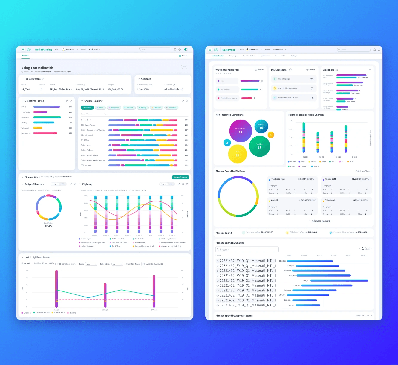


Sizzle Reel
Sizzle Reel
Sizzle Reel
Sizzle Reel
Sizzle Reel
Research
42 personas were identified through extensive user research.
We used A/B testing to evaluate effectiveness of different design options and how they impact key tasks and goal completion rates. By identifying how variants compare against each other, we were able to pinpoint which pathways support users’ utilization of selected decision-making features.
We validate our designs with users at regular intervals, to have a strong pipeline of valuable enhancements that evolve with our users, products and future outlook.


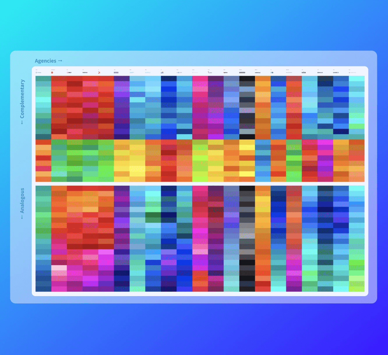
color logic
We developed a proprietary color formula calculation to auto-generate data visualization-appropriate color palettes based on the input of a primary brand color.
The color logic included parameters for accessibility, with 200 accessible variants of the key color being automatically generated.


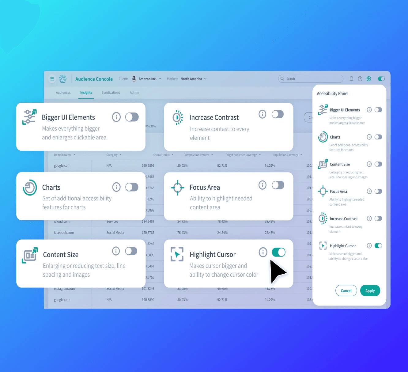
Accessibility Extension
The Global Accessibility Extension allows users to customize their experience - from standard customizations like contrast and font size, to original innovations like a focus module, selecting between extensive color options, and patterns and shading options..
Some of they key features this tool allows users to adjust are:
Enlarge content
Use highlight cursors
Adjust font size
Correct color contrast
Opt to use patterns as shading, which has been recommended to improve readability when distinguishing various groups of data
Turn on all labels for a given report
Repeat data in a table view, which allows users on a screen reader or who have difficulty distinguishing colors a way to navigate through the data without missing any information.


Accessibility Task Force
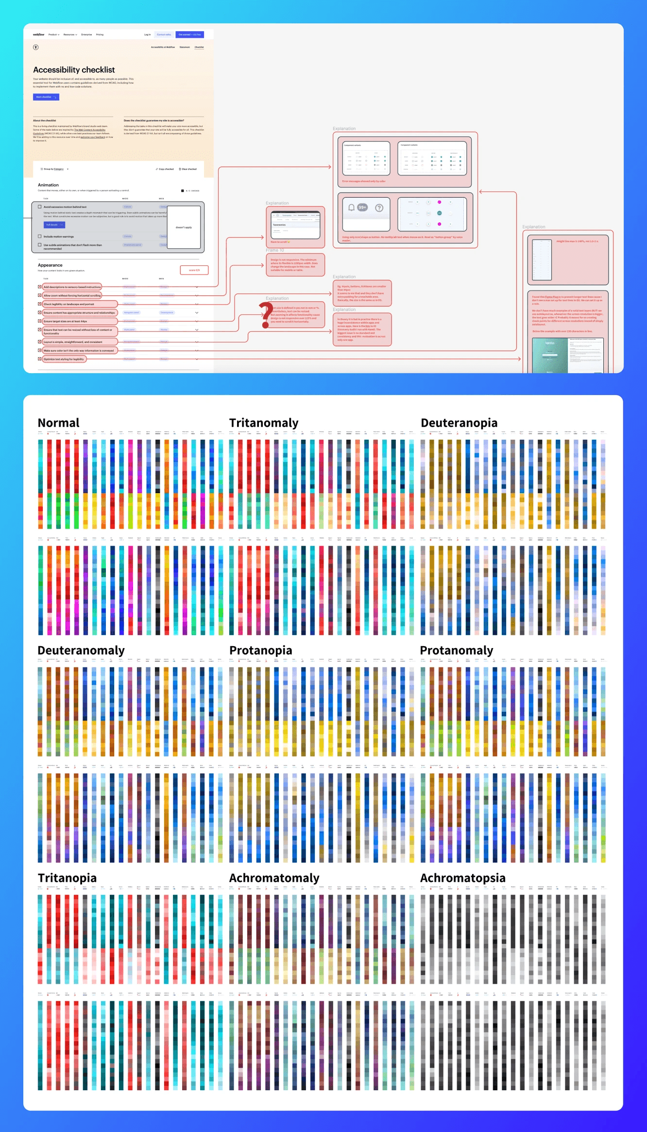
We dissect and evaluate how our design system measures up to standard accessibility guidelines.
data visualization color palettes across agencies are perceived across all color blindness types including tritanomaly, deuteranopia, deuteranomaly, protanopia, protanomaly, tritanopia, achromatomaly and achromatopsia.
Left-Bottom: A snapshot of how standard bar charts in our default Vibrant color palette appears to users across all identified color deficiencies.
We organized an Accessibility task force to optimize accessible experience design across all products in MIE.
This centralized task force continuously evaluates how our design system components and styles measure up against standard accessibility guidelines, and makes recommendations for how we can lead the space in accessibility.
The Data Visualization Accessibility Extension is one of the innovations from this task force, and continues to undergo research and development to provide an global solution to address all identified accessibility issues across our products.


Awards

Indigo Design Award
Gold, 2023
Digital Design of the Year

Indigo Design Award
Gold, 2023
UX, Interface, & Navigation

Indigo Design Award
Gold, 2023
Digital Design for Graphic Design

Indigo Design Award
Gold, 2023
Digital Tools & Utilities

Indigo Design Award
Silver, 2023
Interaction Design for Graphic Design

Indigo Design Award
Silver, 2023
Interactive Design
Awards

Indigo Design Award
Gold, 2023
Digital Design of the Year

Indigo Design Award
Gold, 2023
UX, Interface, & Navigation

Indigo Design Award
Gold, 2023
Digital Design for Graphic Design

Indigo Design Award
Gold, 2023
Digital Tools & Utilities

Indigo Design Award
Silver, 2023
Interaction Design for Graphic Design

Indigo Design Award
Silver, 2023
Interactive Design
Awards

Indigo Design Award
Gold, 2023
Digital Design of the Year

Indigo Design Award
Gold, 2023
UX, Interface, & Navigation

Indigo Design Award
Gold, 2023
Digital Design for Graphic Design

Indigo Design Award
Gold, 2023
Digital Tools & Utilities

Indigo Design Award
Silver, 2023
Interaction Design for Graphic Design

Indigo Design Award
Silver, 2023
Interactive Design
Awards

Indigo Design Award
Gold, 2023
Digital Design of the Year

Indigo Design Award
Gold, 2023
UX, Interface, & Navigation

Indigo Design Award
Gold, 2023
Digital Design for Graphic Design

Indigo Design Award
Gold, 2023
Digital Tools & Utilities

Indigo Design Award
Silver, 2023
Interaction Design for Graphic Design

Indigo Design Award
Silver, 2023
Interactive Design
Awards

Indigo Design Award
Gold, 2023
Digital Design of the Year

Indigo Design Award
Gold, 2023
UX, Interface, & Navigation

Indigo Design Award
Gold, 2023
Digital Design for Graphic Design

Indigo Design Award
Gold, 2023
Digital Tools & Utilities

Indigo Design Award
Silver, 2023
Interaction Design for Graphic Design

Indigo Design Award
Silver, 2023
Interactive Design
